Descarregue o catálogo de produtos
Por favor, introduza o seu endereço de e-mail verdadeiro e enviar-lhe-emos o catálogo eletrónico para a sua caixa de entrada em breve.
Embalagens cosméticas personalizadas para marcas de beleza — solicite hoje mesmo o seu orçamento.

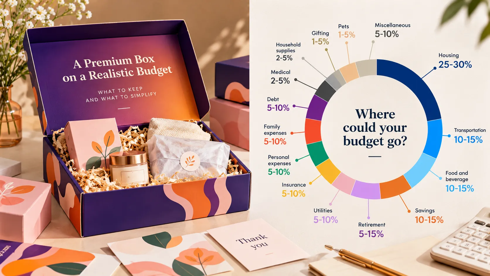
Premium packaging on a budget starts with deciding which details matter most to the product and the person receiving it. For a multi-bottle gift set, the packaging has to present the brand, hold different bottle sizes in place and work as a mailer. A useful design review protects those essentials before comparing optional print and finish choices.
An anonymized U.S. buyer was exploring a small trial run of gift boxes for three hot sauce bottles. The buyer felt that the proposed box cost more than the bottles inside. The packaging brief called for a printed corrugated mailer and an insert that could locate bottles of different sizes. The internal review suggested comparing a fully printed design with a simpler dark exterior, then checking bottle spacing with actual product samples.
One concept is not guaranteed to cost less or look better. For a practical premium packaging on a budget review, compare only the optional print or finish choices while keeping the product set, protection needs and shipping assumptions constant.
Before simplifying artwork, list the job of the package:
The final insert and mailer should be reviewed with the real bottles. Different bottle diameters or shoulder shapes can change the spacing and the amount of support needed. A drawing can help plan the layout, but a physical sample is where the brand can check fit, access and the overall presentation together. For general transit preparation, consult UPS packaging tips.
A box does not need a different visual effect on every panel to feel intentional. Choose the main cue the customer should notice first. It might be the brand color, a focused logo placement, a simple pattern or a short product message. Then decide which secondary details can be simplified without making the set hard to recognize. That is a practical way to approach premium packaging on a budget: keep the brand cues buyers will recognize and simplify details that do not support recognition.
For example, compare a full-color exterior with a restrained dark-color concept and a focused logo. The plainer direction should still be treated as a designed option: confirm the exact color, print coverage and finish on the sample. A dark box is not automatically cheaper or more premium; the materials, printing method, quantity and finishing still affect the quote and appearance.
Ask the supplier to compare two defined concepts using the same bottle set, order quantity, delivery destination and packing assumptions. Keep the bottle positions and required protection consistent so the comparison shows the effect of the design choices rather than a hidden change to the packaging job.
| Decision area | Keep in both concepts | Compare or simplify |
|---|---|---|
| Bottle layout | Space and support for all three real bottle sizes | Insert appearance or less complex construction, if fit remains acceptable |
| Outer mailer | A structure reviewed for the planned packing and delivery use | Print coverage, number of colors or extra decorative panels |
| Brand presentation | One clear brand cue and readable product information | Multiple finishes or repeated graphics that do not add useful recognition |
| Quote basis | Same quantity, destination and delivery scope | Sample, setup, print and finish choices shown as separate line items where available |
The table is a discussion guide, not a promise that any specific change will lower the price. Request a revised quote for each defined version and review what is included.
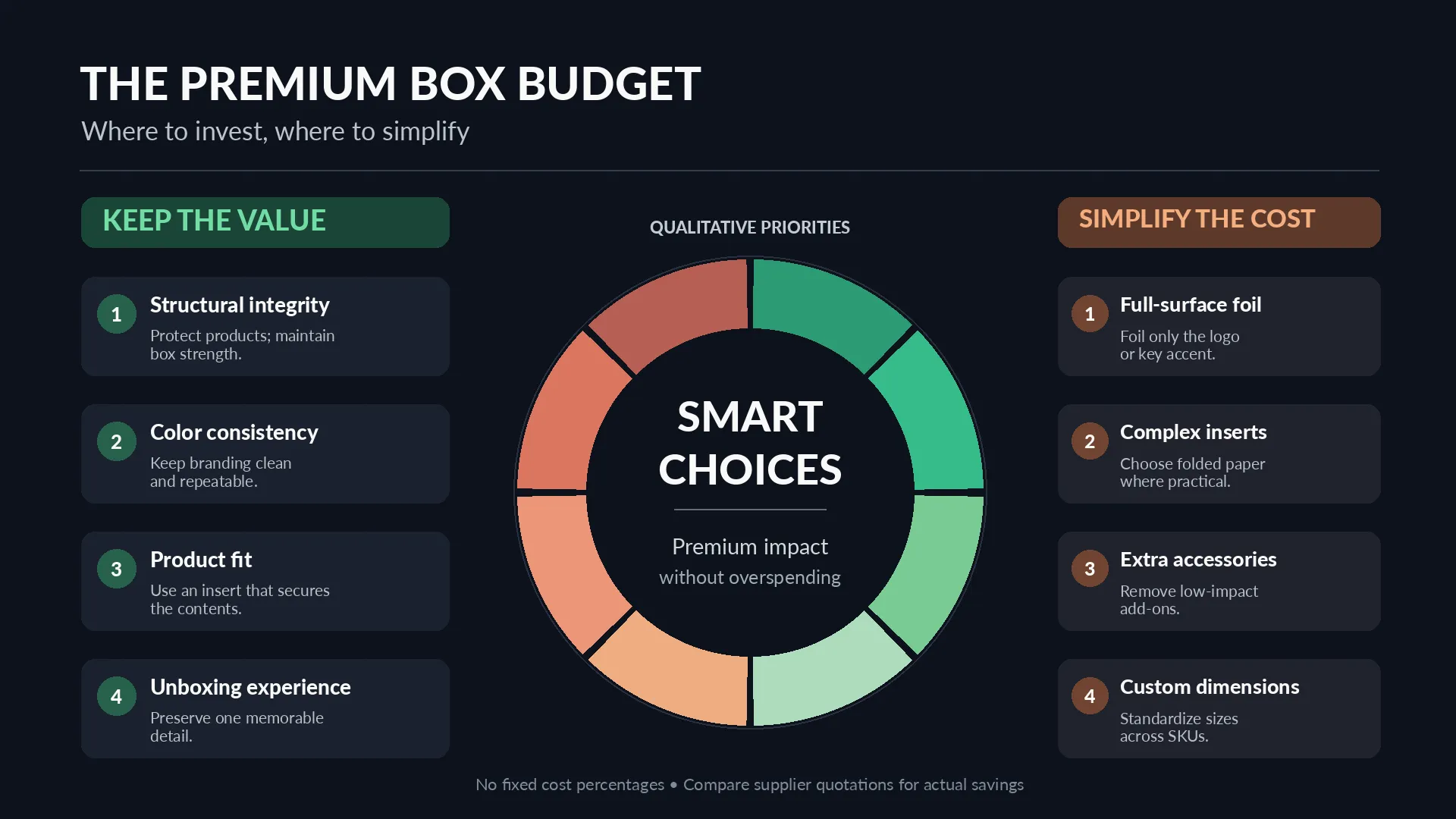
When the box feels expensive next to the product, it helps to ask what the quoted amount covers. Separate the sample and any setup charges from the production quantity where applicable. Confirm whether the quote includes the insert, printing, selected finish, packing method and delivery to the stated destination. Ask whether each concept uses the same shipping method and packing quantity.
This makes it easier to decide whether to simplify the artwork, reconsider a finish or review the structure. It also avoids cutting the insert first simply because it is less visible in a product photo. For more on the broader cost comparison, see our guide to reducing packaging and shipping costs.
Use the sample review to check that the bottles sit in their intended positions, the insert supports the chosen layout, and the mailer can be closed and packed as planned. Review the outside and the open-box view. Check that the logo and key product information remain easy to see on the selected color and print treatment. For premium packaging on a budget, use the sample to verify that the selected fit, materials and branding work together before confirming the specification.
Record the approved artwork version, insert layout, material and finish. If one of these changes in a later revision, review whether the sample or quote needs to be updated. A sample confirms the version that was reviewed; it does not automatically validate a different bottle, insert or shipping arrangement.
Yes. A restrained design can look deliberate when the color, logo placement, material and details work together. Review the actual sample because a digital mock-up cannot fully show the selected paper and finish.
Compare optional print coverage, colors and decorative finishes while holding the bottle layout and required protection constant. Ask for a revised quote for each version instead of assuming which element has the largest price effect.
Not without checking the bottles in the proposed mailer. The insert is part of the product arrangement and may help keep different bottle sizes in place. Review any alternative with the actual bottles and agreed packing method before approving it.
For premium packaging on a budget, share the bottle dimensions, number of bottles, target quantity, delivery destination, visual priorities and budget range when requesting a quote. Crown Win can review the packaging brief and discuss which elements should stay in the sample while print or finish options are compared.